Live Music Performances
Optimize the concert ticket purchase experience
Goal
To design a considerate product for the customer who wishes to purchase concert tickets for a popular show that might sell out on the release date.
The Challenge
When concert tickets are first released for a highly sought-after show, customers can be kept waiting in a queue, sometimes for as long as an hour or more as servers struggle to cope with the volume of traffic.
This concept also applies to retail during the holiday season.
The Vision
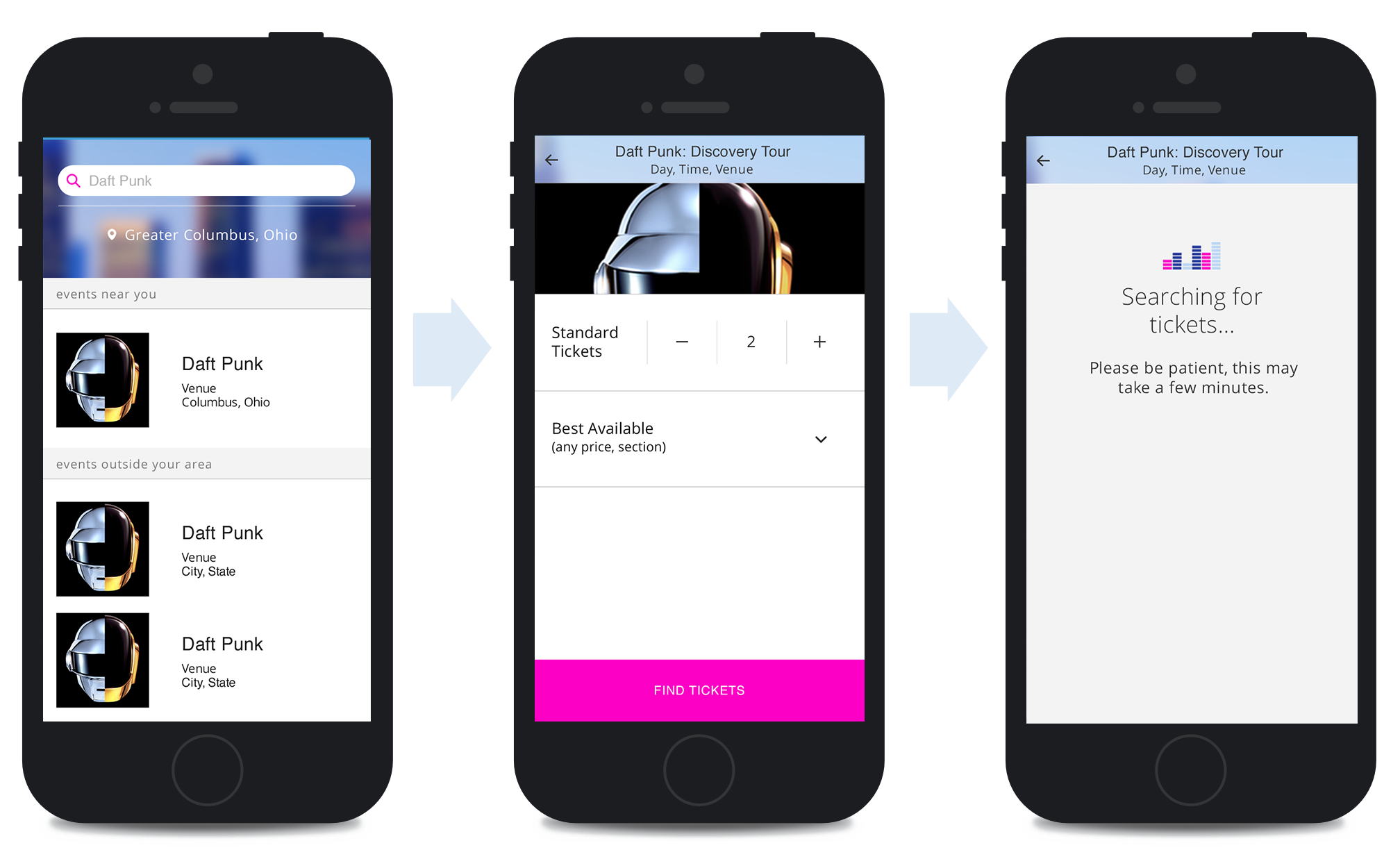
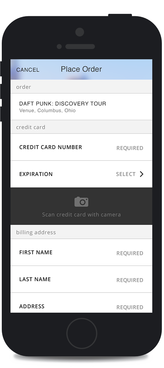
I envisioned a considerate product that allows the customer to feel in control of their experience and that respects their time, data and attention. This service allows the user to place an order and add payment information or use saved payment information instead of waiting in line.
The Service
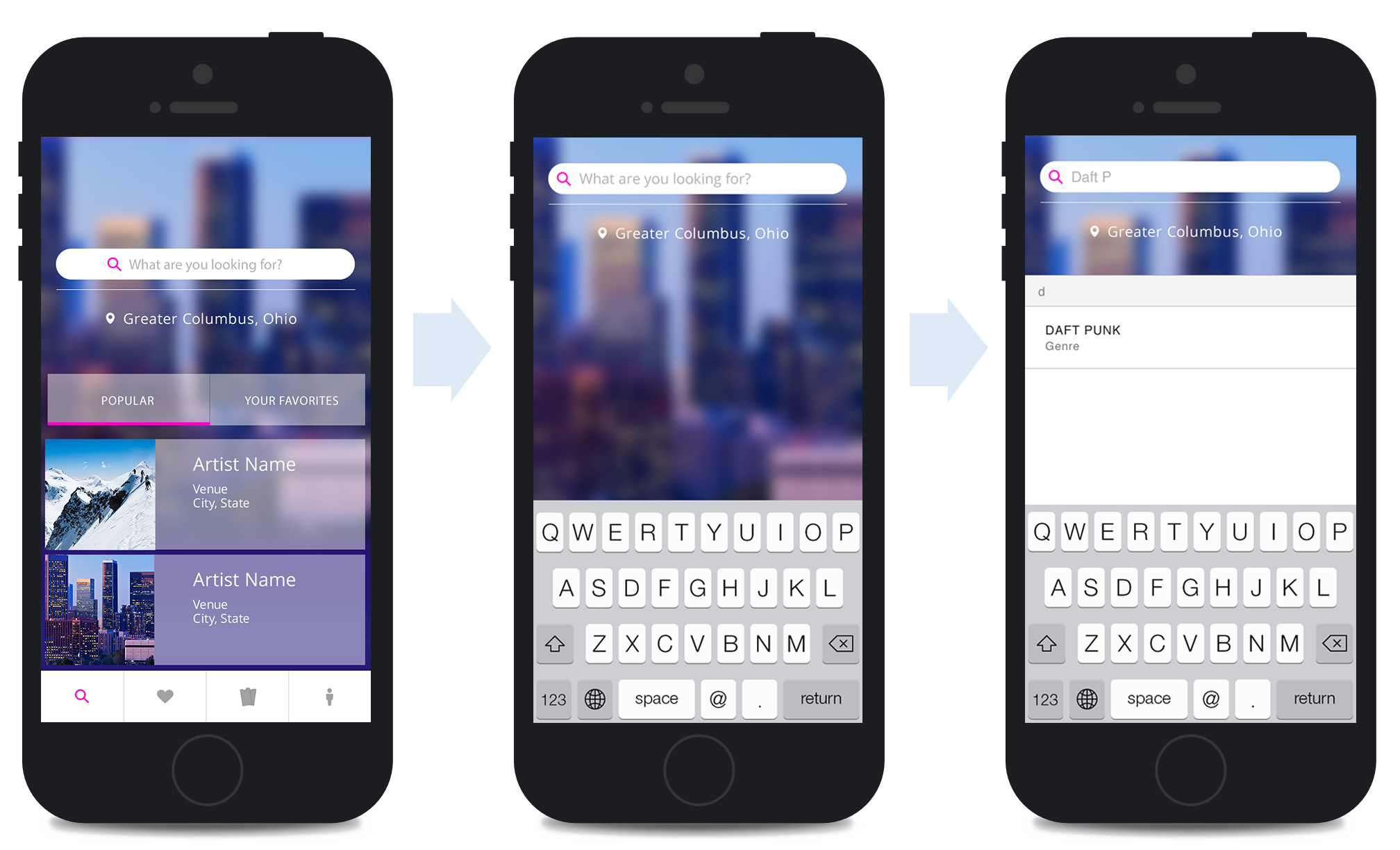
Search-Driven Navigation
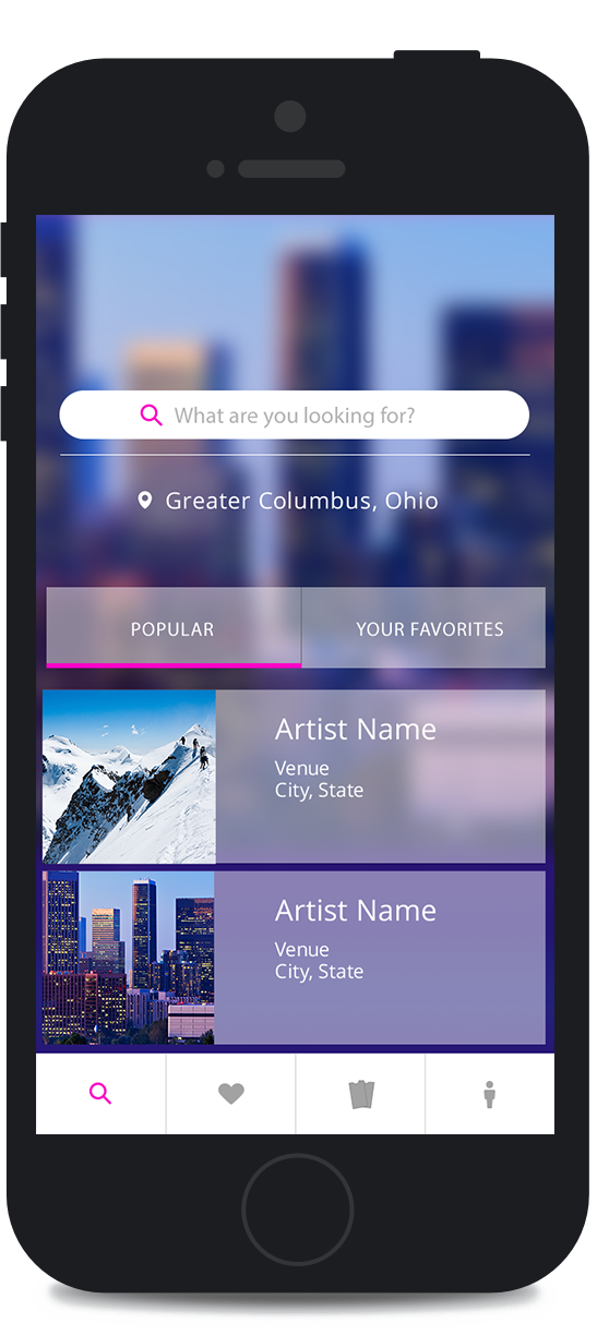
Since it's likely the user will have a solid idea of what concert they'd like to seek out, I implemented and emphasized search-driven navigation.
Convenient Options
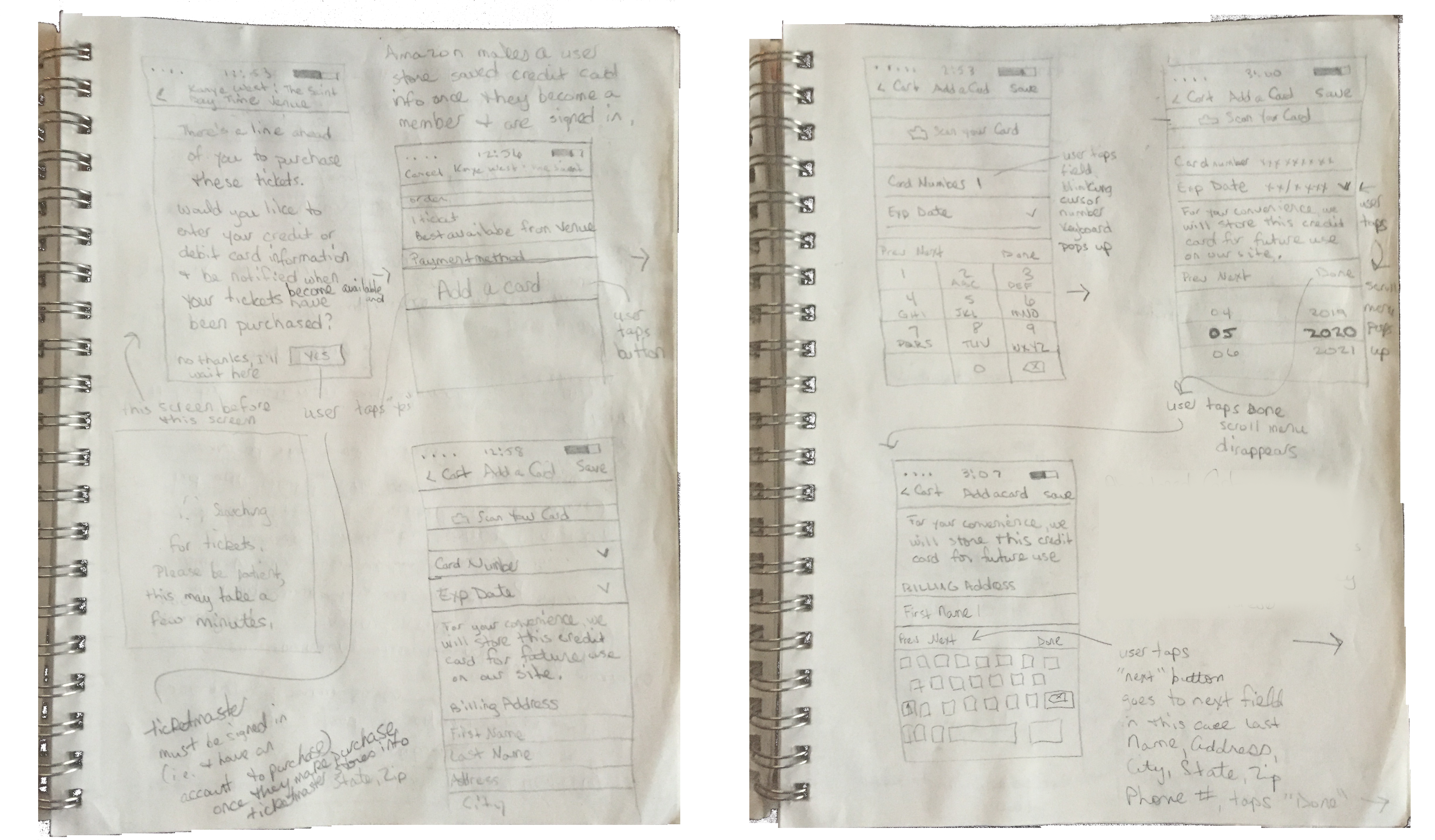
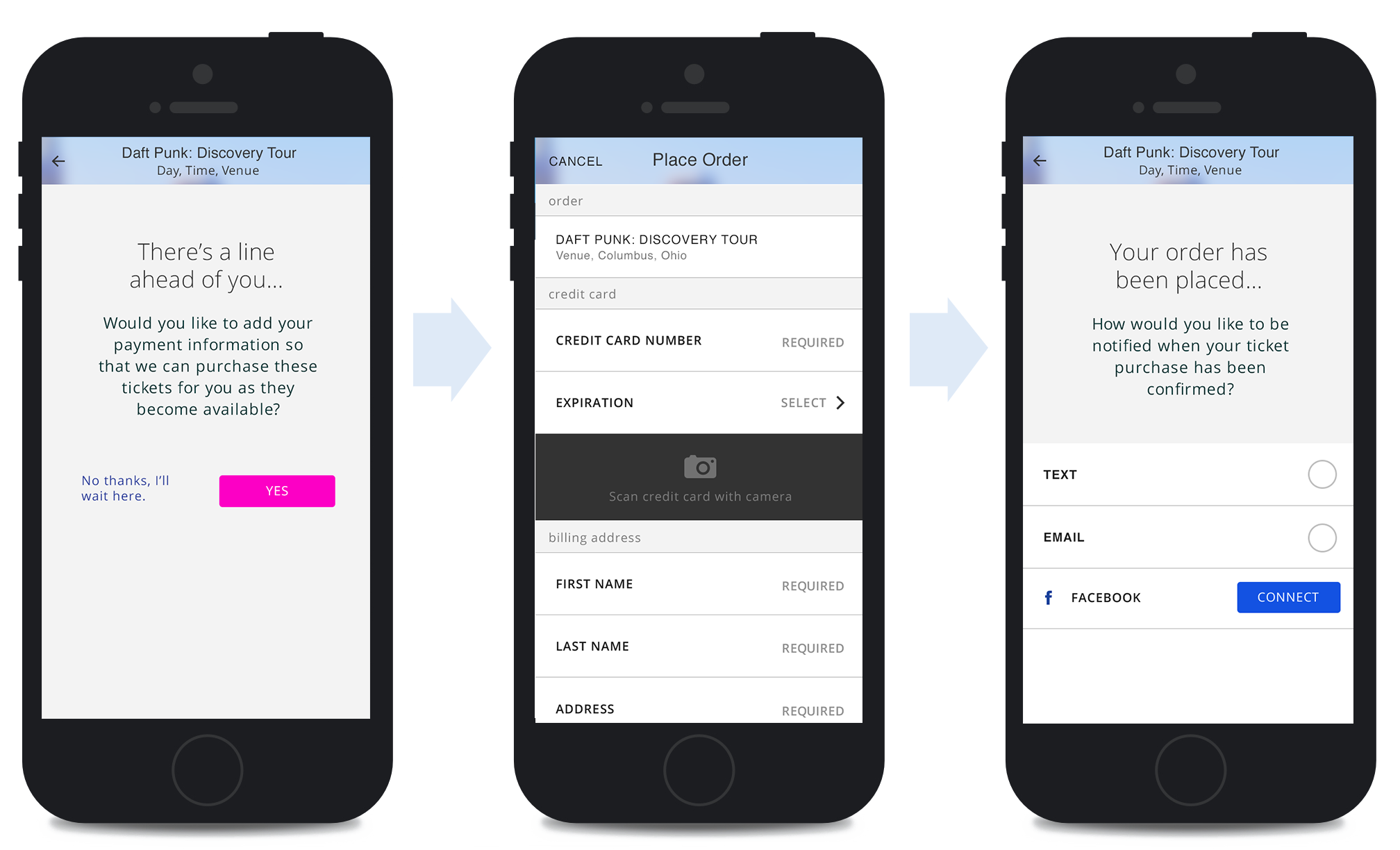
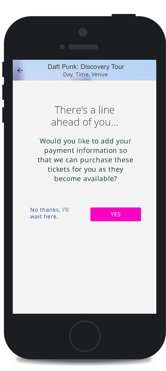
If the server is busy, the screen clearly communicates that there's a line and presents the user with options that increase ease in accessibility and decrease frustration. The customer can place an order by adding payment information or using saved card information or if they feel most comfortable, they can continue to wait in line.
Prioritize Customer Goals
Adding payment information does not guarantee that tickets will become available, but it holds the user's place in line. At this point in the customer journey, the user is free to move forward with their day and can expect to receive a notification when (and if) tickets become available. Their card is not charged until the order is fullfilled. This was designed to respect customer time, data and attention and ease server load.
Notifications That Delight
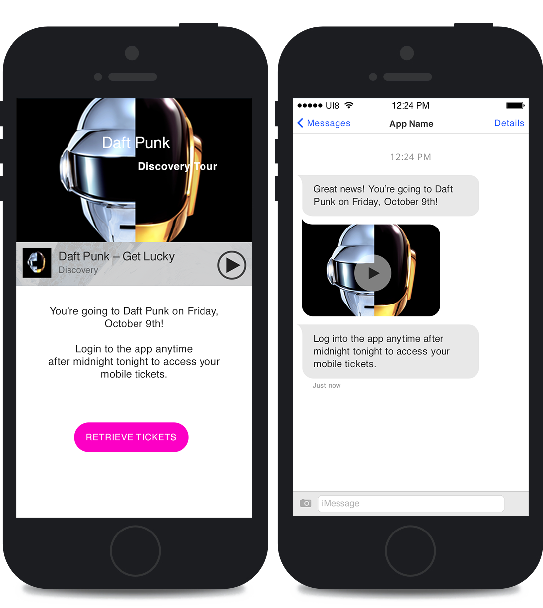
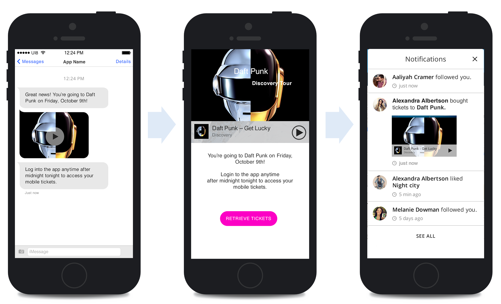
The service lets you know when it finds tickets for you via text, email and/or Facebook notifications. In the event of a Facebook notification, the user learns and celebrates the good news AT THE SAME TIME as their friends, resulting in an engaging, pleasurable and memorable experience worth sharing. Text, email and Facebook notifications include an exclusive video clip from the artists recent tour schedule.
