Email Verification
Simplifying a complex user flow with microcopy
I was responsible for leading the UX strategy, translating complex business requirements and user goals into simple and low-friction experiences.
I led the full design process, from goals and needs identification, research, flows, interaction models and high-fidelity mock-ups within existing brand guidelines in an iterative software development environment.
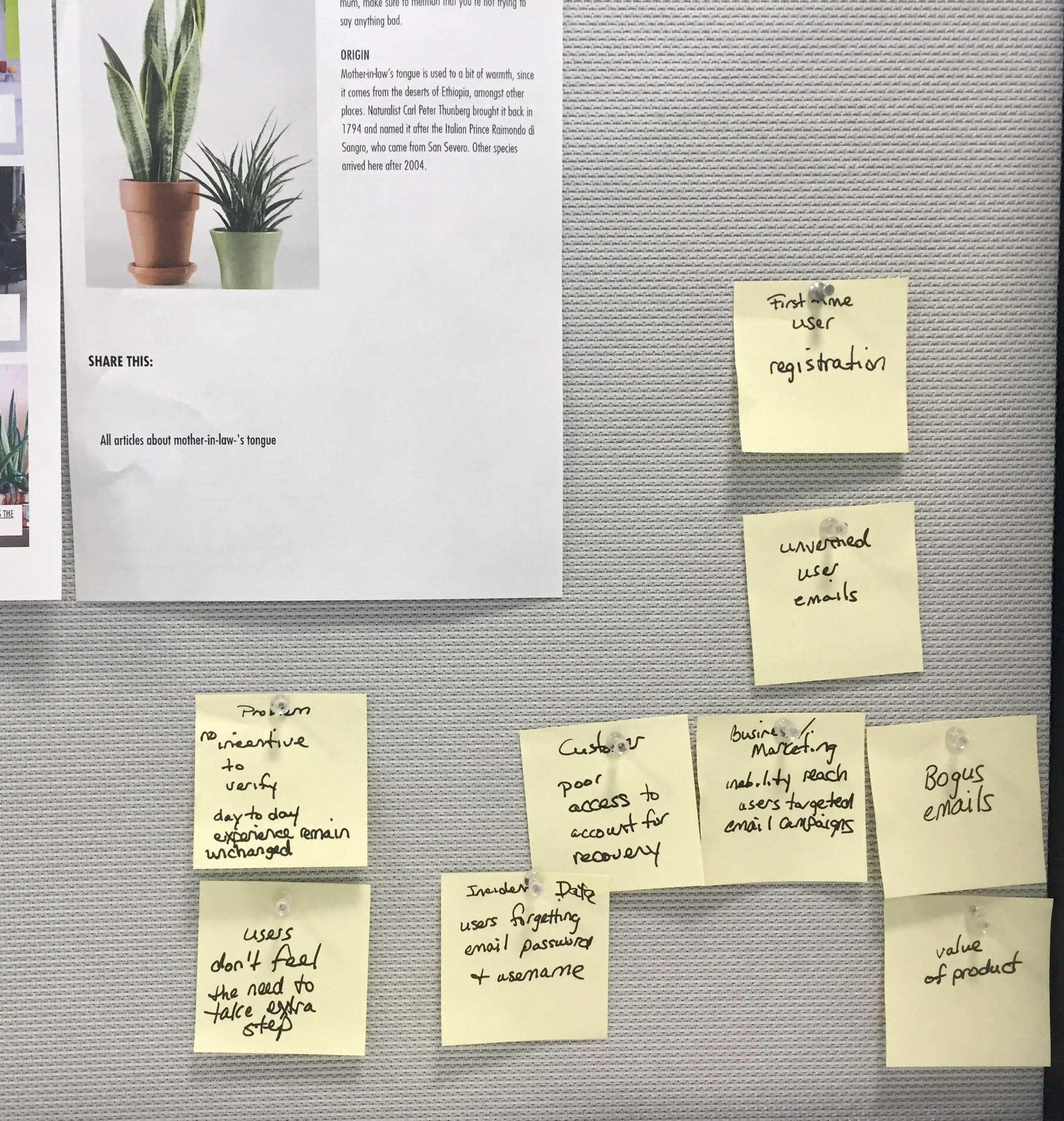
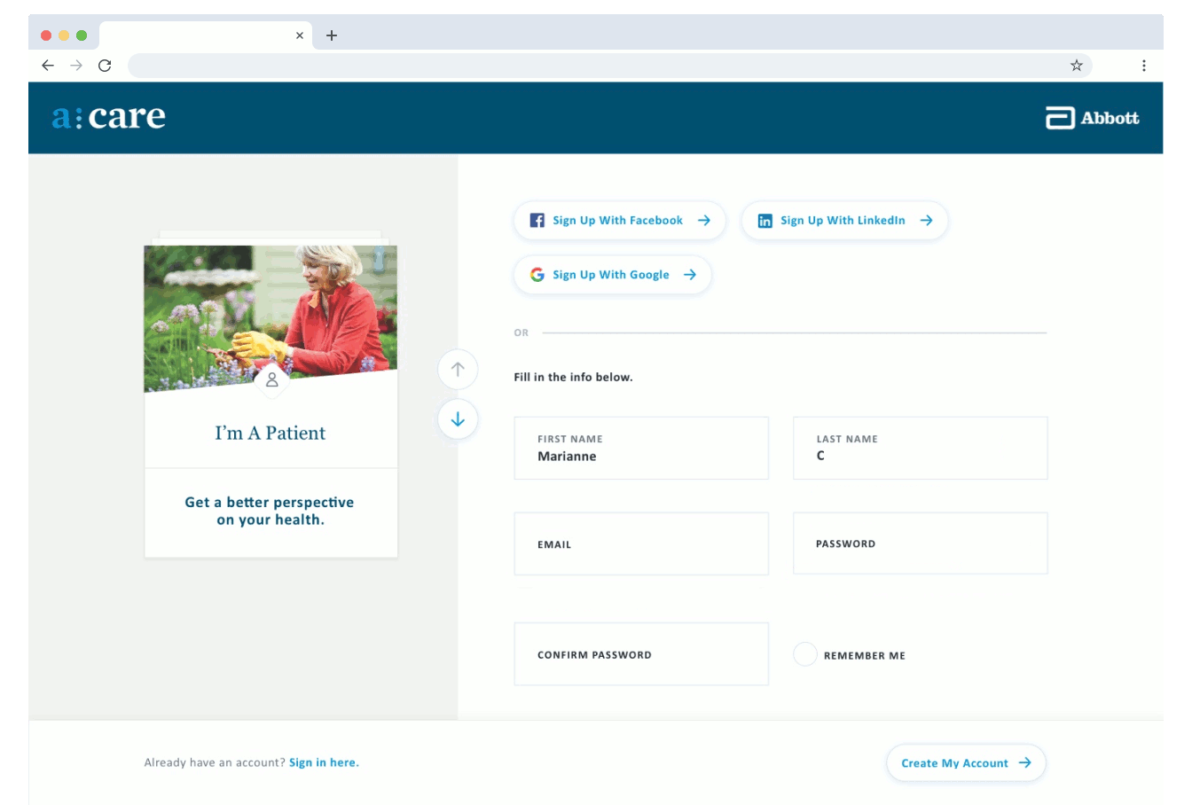
We discovered that customers were either forgetting the email address they used to sign up for the product or were giving us fake email accounts. Our goal was to change this behavior and increase the number of verified emails across both the mobile and desktop. Unverified user emails lead to poor access to account recovery for the customer and for the business/marketing team, create an inability to reach users with targeted email campaigns.
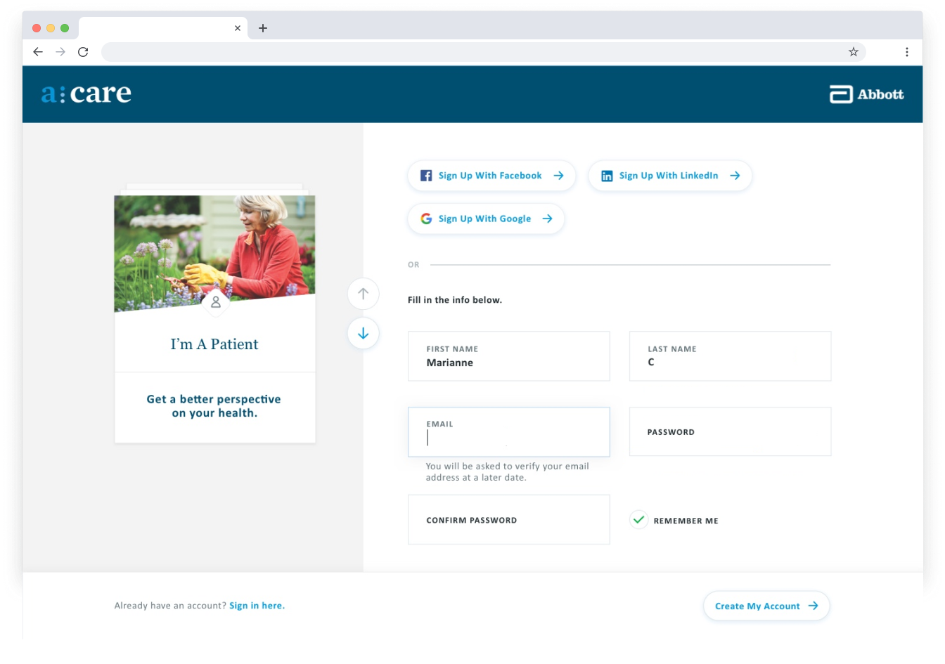
The business tasked me with providing the user an option to update their email address and get a verification email at the new address working within the existing brand guidelines. In addition, I recommended adding microcopy to the sign-up page notifying the customer that they will be asked to verify their email address at a later date. Those who were making an error most likely did so because they had incomplete or incorrect information about the task. (Poka-yoke, error prevention) Showing a notification allows the user to assess all the information displayed and make a decision. This experience strategy emphasizes reducing and/or preventing user error.
For the use case where users were giving us fake email accounts, this strategy creates a transparent interaction for the customers who are uncertain about the value of the product. With some products, there is no incentive to verify emails. The day to day experience remains unchanged, so users don't feel the need to take the extra step. With acare, the user must verify their email upon second login or they won't be granted access to the product. With this level of tranparency, the user interface facilitates and minimizes user input at later stages of the user journey.
As an added value to the business, this approach requires very little effort from the engineering team to implement.
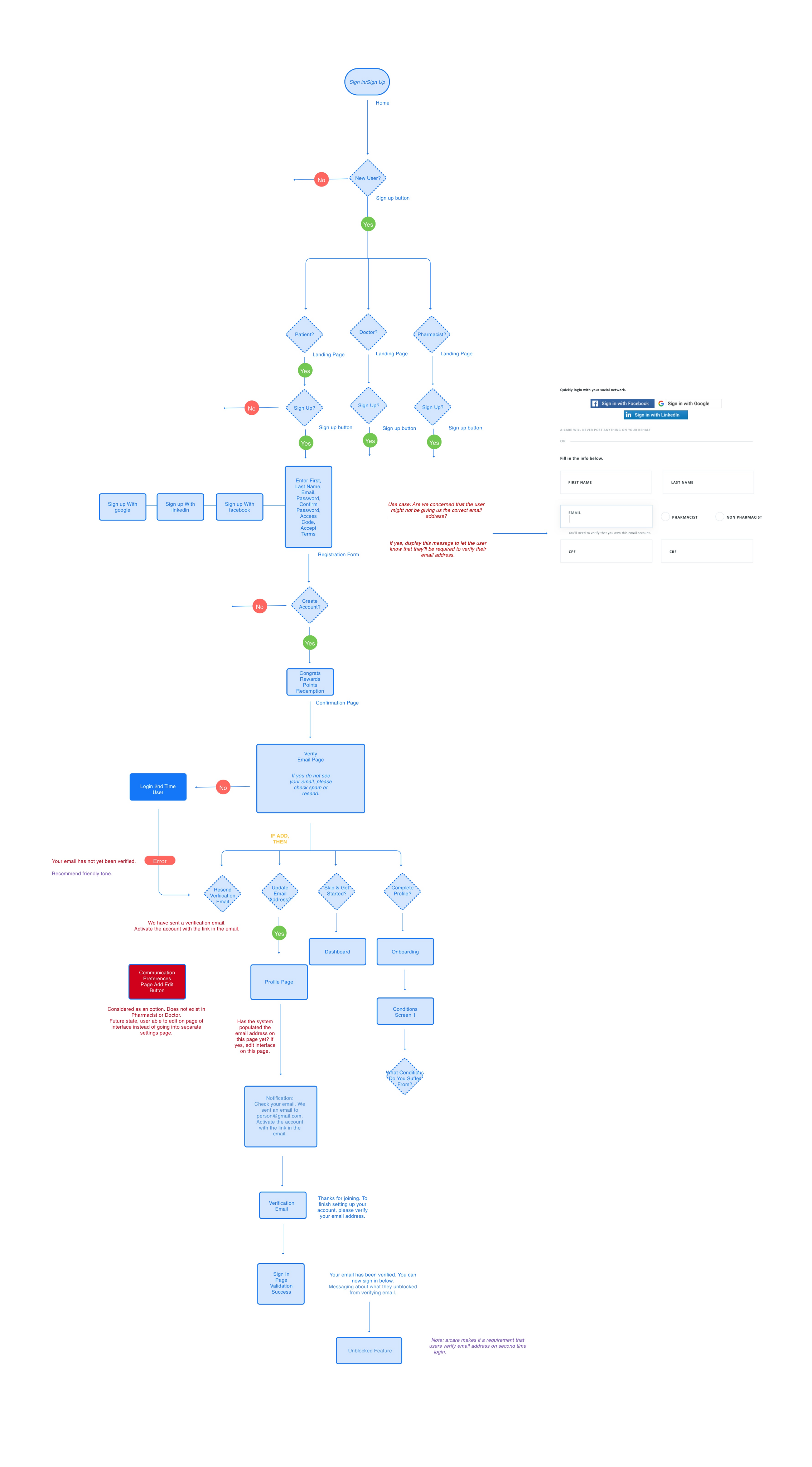
I utilized concept mapping, user flows, and prototyping to share the vision, design principles and experience strategy.
The email input field automatically focus' when the user clicks on field and a notification displays below that field notifying the customer that their email address must be verified at a later date.